Warm or Cool? Coloring Your Summer Furniture for a Bright Vibe
As summer 2025 approaches, are you staring at your living space feeling something’s missing? That vibrant summer energy seems trapped outside while your furniture sits in a sea of uninspired colors. The right color palette can transform your summer furniture from ordinary to extraordinary – creating either a refreshingly cool sanctuary or a warmly inviting haven during these sun-soaked months.
The post-pandemic era has shifted our relationship with our homes, making thoughtful color choices more important than ever. Whether you’re drawn to the tranquil serenity of turquoise blue and sky blue that mimic clear summer skies, or the warm optimism of marigold and coral pink that radiate positivity – your summer furniture color choices speak volumes. 🌈 Finding the perfect temperature balance in your color palette isn’t just about aesthetics—it’s about creating a mood that sustains you through the season. In the following sections, we’ll explore how cool, warm, and neutral color palettes can transform your summer furniture, strategic color combinations that sing, and how to infuse your space with that bright summer vibe you’ve been craving.
Understanding Color Temperature for Summer Furniture
Color isn’t just something you see – it’s something you feel. When choosing furniture for summer, understanding color temperature can make the difference between a space that feels like a refreshing oasis and one that feels like a sauna in July.
Warm vs. Cool Colors: What Works Best in Summer
The battle between warm and cool colors for summer spaces isn’t actually much of a fight. Each brings something special to your rooms.
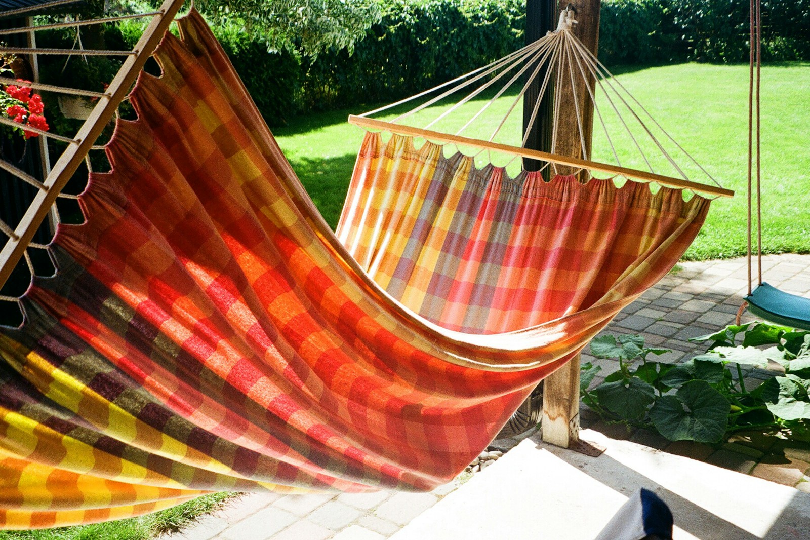
Warm colors (reds, oranges, yellows) add energy and excitement. They’re like that friend who shows up with unexpected concert tickets – they create instant buzz. These shades can make even the most spacious room feel cozy and intimate.
Cool colors (blues, greens, purples) do the opposite. They expand your space visually and create a sense of calm – exactly what you need when it’s 95 degrees outside. They’re the friend who brings over a homemade pitcher of lemonade when your AC breaks.
Here’s a quick breakdown of how different colors affect your summer space:
| Color | Effect on Space | Best Used For |
|---|---|---|
| Blue | Creates calm, expands space | Bedrooms, bathrooms, meditation corners |
| Green | Connects to nature, refreshes | Sunrooms, kitchens, anywhere needing life |
| Yellow | Energizes, stimulates conversation | Dining areas, creative spaces |
| Orange | Warms and excites | Accent pieces, social areas |
| White | Maximizes light, creates openness | Anywhere needing brightness |
The trick isn’t picking one temperature over another – it’s knowing when and where to use each.
Post-Pandemic Color Psychology for Living Spaces
Our connection to our residences underwent significant transformation during the pandemic.. Before 2020, we primarily wanted our spaces to look good. Now? We need them to feel good.
This shift explains the massive surge in biophilic colors – those earthy greens, ocean blues, and sunset oranges that connect us to the natural world. When we were unable to go outdoors, we brought the outdoors inside.
Post-pandemic summer furniture trends show people craving both security and freedom in their color choices. Many are opting for:
- Nature-inspired blues and greens that promote calm
- When we were unable to go outdoors, we brought the outdoors inside
- Soft whites and creams that create breathing room
- Unexpected pops of joy colors like coral or turquoise
The most significant change? People are less concerned with what’s trendy and more focused on what makes them personally feel good in their space.
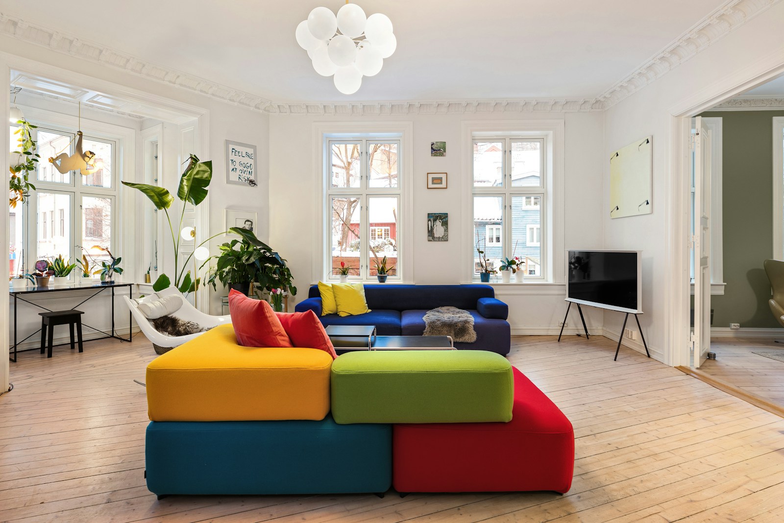
Creating Balance Between Vibrancy and Tranquility
The sweet spot for summer furniture colors isn’t all vibrant or all calm – it’s the thoughtful dance between the two.
Think of color temperature as seasoning. Too much spice overwhelms; too little leaves things bland. The most successful summer spaces use the 60-30-10 rule:
- When we were unable to go outdoors, we brought the outdoors inside
- 30% secondary color (can be complementary or contrasting)
- 10% accent color (your statement piece – can be bold and warm)
This approach gives you the energy of warm colors without the visual heat, and the calm of cool colors without tipping into coldness.
Smart moves include:
- Pairing a cool blue sofa with warm orange throw pillows
- Setting off mint green walls with copper accessories
- Anchoring a white room with natural wood tones and a single bold chair
Remember that lighting changes everything. That perfect teal that looks refreshing during day might feel chilly at night without warm lighting to balance it.
Cool Color Palette Options for a Refreshing Summer Vibe
Turquoise Blue: Creativity and Serenity Combined
Summer screams for colors that make you feel like you’re on vacation even when you’re just lounging in your backyard. Turquoise blue tops the list for cool summer furniture choices, and for good reason.
This captivating shade sits at the perfect intersection of blue and green, creating a visual retreat that instantly cools down any space. I’ve seen turquoise transform the most mundane patios into coastal-inspired paradises.
What makes turquoise so special is its versatility. Go bold with a turquoise sofa as your statement piece, or start small with accent pillows and throws. Either way, you’ll notice how the color seems to lower the temperature by a few degrees (visually, at least).
The psychological effects are worth mentioning too. Turquoise promotes:
- Mental clarity during those hazy summer afternoons
- Creative thinking while you’re entertaining guests
- A sense of escape, even when you’re stuck at home during a heatwave
Pair turquoise with natural wood tones for a beachy feel, or with white for that Mediterranean villa vibe we all secretly crave.
Muted Grey: Modern Appeal with Heat-Mitigating Properties
Grey isn’t just for winter anymore. The right shade of muted grey can be your summer furniture’s best friend.
Unlike darker greys that absorb heat, lighter muted greys reflect sunlight while maintaining that sleek, modern aesthetic that works year-round. It’s practical magic for outdoor furniture that sits in direct sunlight.
The beauty of grey lies in its chameleon-like quality. It changes subtly throughout the day as light shifts, creating dynamic spaces without any effort on your part.
Grey furniture also hides those inevitable summer spills and stains better than most colors. Dropped some ice cream on your grey outdoor sectional? No big deal. The forgiving nature of this neutral makes it perfect for carefree summer entertaining.
Greyish Blue: Balance and Tranquility for Hot Weather

When you can’t decide between grey’s sophistication and blue’s cooling properties, greyish blue delivers the best of both worlds.
This understated shade works overtime in summer spaces. The blue undertones provide that essential cool feeling, while the grey component adds depth and keeps things from looking too themed or seasonal.
I’ve noticed greyish blue works particularly well in transitional spaces like covered porches and sunrooms. It bridges indoor refinement with outdoor freshness in a way few colors can manage.
The real superpower of greyish blue is its calming effect. When summer heat frays nerves and tests patience, furniture in this shade creates a peaceful sanctuary where you can actually unwind.
Sky Blue: Bringing Clear Summer Skies Indoors
Nothing says summer quite like a perfect blue sky, so why not capture that feeling in your furniture choices?
Sky blue furniture instantly lifts the mood of any space. It’s the color equivalent of opening all the windows on the first warm day of the year. Fresh, optimistic, and undeniably summery.
This shade works wonders in spaces that lack natural light. Even the stuffiest room feels airier and more breathable with strategic pops of sky blue. Think accent chairs, ottomans, or even a statement dining set.
The psychological boost can’t be overstated. Sky blue furniture triggers associations with:
- Endless vacation days
- Freedom and possibility
- Childhood memories of summer adventures
For maximum impact, contrast sky blue pieces with white walls and natural textures like jute, rattan, or light oak. The combination creates spaces that feel both grounded and uplifting.
Warm Color Choices to Brighten Summer Furniture
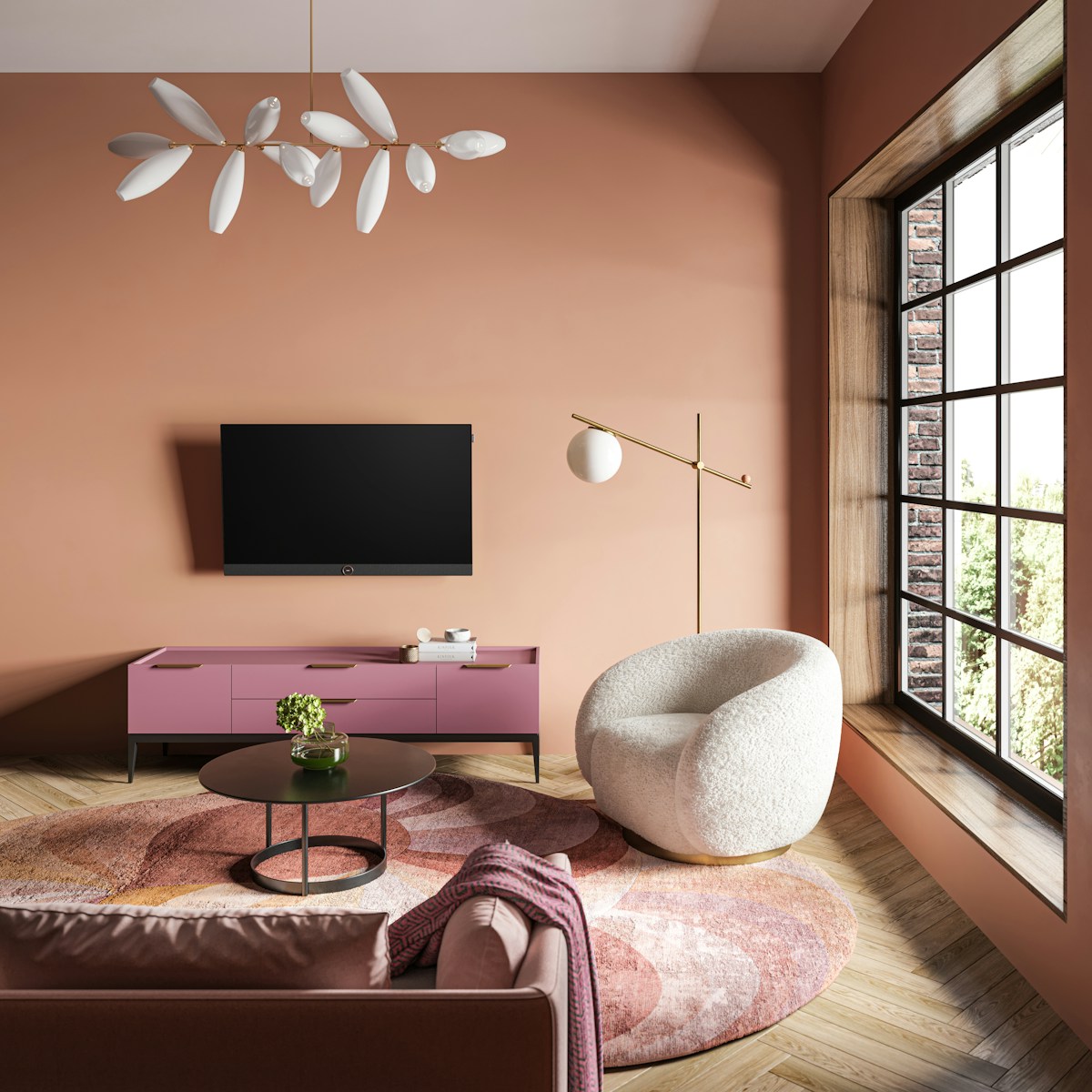
Pale Peach: Optimism with Soothing Earthiness
Summer’s calling and pale peach is answering with open arms. This delicate hue sits right in the sweet spot between energetic and calming – perfect for those summer days when you want your space to feel alive but not overwhelming.
What makes pale peach so special? It’s that subtle warmth that mimics early morning sunlight filtering through your windows. Unlike bold oranges that can sometimes feel a bit much, pale peach whispers rather than shouts.
I’ve seen this color transform the most ordinary patio furniture into conversation pieces. A pale peach cushion on a wicker chair instantly creates that “sit here and stay awhile” vibe that summer gatherings are made for.
Try pairing it with natural materials – think teak or bamboo furniture. The combination feels organic and intentional, like the furniture was always meant to be that color. And here’s a little designer secret: pale peach actually makes people’s skin tones look more vibrant and healthy – a natural filter for your summer selfies!
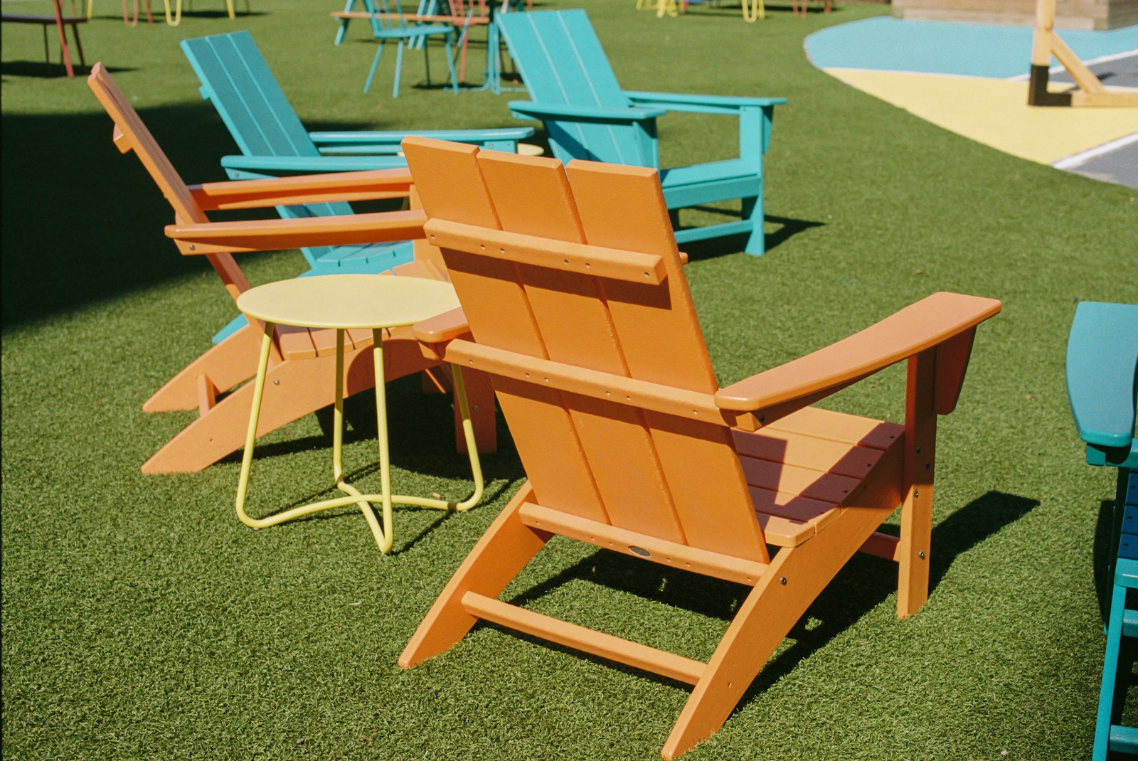
Marigold: Uplifting Energy with Yellow-Orange Blends
Marigold is summer’s power player. This yellow-orange blend packs a serious punch of happiness that can turn even the gloomiest summer day around.
Picture this: a marigold accent chair against a neutral patio. It’s like placing a little sun right in your outdoor space. Your guests won’t just be drawn to it – they’ll practically orbit around it.
The magic of marigold is its versatility. It plays well with nearly every other summer color, from deep blues to forest greens. I recently updated a client’s screened porch with marigold cushions on navy furniture, and the combination was electric.
Marigold furniture isn’t just pretty – it’s practical too. The intensity of the color naturally hides those inevitable summer spills and stains better than lighter options. And unlike trendy colors that come and go, marigold has staying power. It’s been a designer favorite for decades because it references nature’s own palette.
Coral Pink: Warmth that Brightens Natural Interiors
Coral pink is the color equivalent of that friend who lights up every room they enter. Not quite pink, not quite orange – it’s that perfect in-between shade that feels both fresh and familiar.
What makes coral so brilliant for summer furniture is how it interacts with natural light. As the sun moves throughout the day, coral pink shifts and changes, sometimes leaning more salmon, other times flashing hints of peachy tones.
I’m constantly recommending coral for clients who want their spaces to feel both sophisticated and playful. A coral pink outdoor sofa becomes the heart of any patio design, especially when surrounded by plenty of greenery.
Sandy Brown: Beach-Inspired Elegance
The beauty of sandy brown is how it grounds a space while still feeling decidedly summery. It’s like bringing the beach home with you – minus the actual sand in your shoes.
Sandy brown furniture creates an instant sense of relaxation. There’s something about these neutral-warm tones that signals to our brains it’s time to unwind. Maybe it’s the beach association or perhaps it’s the earthy connection – either way, it works.
I’ve found sandy brown to be particularly effective for larger furniture pieces. A sandy brown sectional provides that perfect backdrop for brighter accent pillows and accessories that can be swapped out as seasons or moods change.
The true genius of sandy brown is its longevity. While trendier colors might feel dated in a few years, sandy brown has that timeless quality that ensures your investment pieces will look relevant for many summers to come.
Classic White: Spaciousness and Timeless Appeal
White furniture isn’t just a passing trend – it’s a summer staple that refuses to go out of style. The magic of white is how it instantly makes your outdoor space feel bigger and brighter. That cramped patio? Suddenly feels like a sprawling oasis when you add white chairs or a sleek white table.
White works because it reflects light rather than absorbs it. On those blazing summer days, your white furniture stays cooler to the touch than darker pieces. And talk about versatility! White pairs with literally everything. Going for a coastal vibe? White and blue is your answer. Tropical paradise? White with pops of bright coral or yellow. Minimalist zen garden? White and bamboo tones create the perfect backdrop.
Many homeowners worry about keeping white furniture clean, especially outdoors. But here’s the secret – today’s outdoor white furniture comes with amazing stain-resistant technologies. A quick wipe down with soap and water handles most messes, and many pieces have removable covers you can toss in the wash.
When shopping for white summer furniture, look for:
- UV-resistant materials that won’t yellow
- Water-repellent fabrics
- Pieces with washable covers
- Textured whites (they hide dirt better than flat whites)
Sophisticated Beige: Creating Serene Summer Environments
Beige has gotten a bad rap as boring, but nothing could be further from the truth for summer decorating. Think of beige as the ultimate chameleon – it morphs from warm sand tones to cool stone hues depending on your accessories.
The beauty of beige summer furniture is how it grounds your space while letting nature take center stage. Your garden’s flowers, the blue sky, green trees – they all pop against a neutral beige backdrop. It’s like creating a gallery where Mother Nature is the featured artist.
Beige also hides dust and dirt way better than white, making it practical for families with kids or pets. And unlike trendy colors that might feel dated next season, beige furniture is an investment that stands the test of time.
Try these styling tricks with beige pieces:
- Layer different beige tones for depth
- Add texture through woven materials like rattan or jute
- Incorporate natural wood elements
- Use colorful pillows that can be swapped seasonally
Emerald Green: Luxurious Natural Elements for Peaceful Havens
Emerald green might not scream “neutral” at first glance, but in outdoor spaces, it functions as a sophisticated natural tone that blends seamlessly with landscaping. Rich emerald creates an instant sense of luxury while feeling completely at home in garden settings.
This jewel tone has an uncanny ability to make spaces feel cooler during hot summer months. The psychological effect of surrounding yourself with deep green mimics the feeling of sitting under shady trees – even when you’re lounging on your sun-drenched deck.
Emerald green furniture creates natural focal points without overwhelming your outdoor design. Pair an emerald sofa with neutral accessories, or make a statement with emerald accent chairs against white or beige larger pieces.
The versatility of emerald shines in how it works with both warm and cool color schemes:
- Utilizing shades of orange and yellow, it generates a lively tropical atmosphere
- With blues and purples, it feels sophisticated and calming
- With metallics like brass or gold, it exudes pure luxury
What makes emerald truly special is how it bridges the gap between your landscaping and your furniture. That disconnect between harsh man-made elements and natural surroundings disappears when emerald green becomes your connector color.
Strategic Color Combinations for Summer Furniture
Pairing White Furniture with Colorful Backgrounds
White furniture is like the perfect blank canvas for summer decorating. But don’t think it’s boring—it’s actually your secret weapon for creating those jaw-dropping summer spaces that make your neighbors jealous.
White patio sets, lounge chairs, and dining tables pop dramatically against vibrant backdrops. Picture this: a crisp white sofa set against a cobalt blue wall or surrounded by lush green plants. That contrast? It’s magic.
Try these pairings that are absolutely killing it this summer:
- White wicker chairs + turquoise cushions + terracotta planters
- Bright white Adirondack chairs against a fence painted in coral or salmon
- A pristine white dining set encircled by vibrant hot pink bougainvillea or bright yellow sunflowers
The trick is to think of your white furniture as the star actor and your colorful background as the supporting cast. They make each other look good.
And hey—don’t forget about your floors! A brightly colored outdoor rug under white furniture creates this amazing framing effect that pulls the whole scene together.
Creating Contrast with Complementary Summer Shades
Color theory isn’t just for art class. It’s your ticket to summer furniture that looks intentional and designer-worthy.
Complementary colors, which are positioned opposite one another on the color wheel, generate a sense of energy and excitement—precisely the atmosphere that summer spaces ought to embody. Think blue and orange, purple and yellow, or red and green.
Some winning summer combos that work every time:
- Navy blue sofas with coral or peach pillows and throws
- Teal loungers with rust-colored side tables
- Lavender chairs paired with yellow accessories
The effectiveness of these combinations lies in the visual tension they generate. Your eye naturally bounces between the colors, creating this lively feeling that’s perfect for summer entertaining.
One smart approach? Choose one dominant color for your main furniture pieces and use the complementary color as an accent. Too much of both can be overwhelming—like trying to listen to two different songs at once.
Layering Textures to Enhance Color Impact
Colors aren’t just about, well, color. They’re about how they feel.
Summer furniture that truly stands out combines colors with interesting textures. This adds dimension and makes colors appear richer and more sophisticated.
Think about these texture combinations:
- Smooth, glossy ceramic side tables in bright colors next to natural rattan chairs
- Rough, rustic wooden benches painted in pastels alongside sleek metal accessories
- Soft, plush cushions in bold patterns atop smooth teak furniture
The contrast between rough and smooth, matte and glossy, creates this multi-sensory experience that’s way more interesting than just plopping down some colorful furniture.
Weather-resistant velvet (yes, it exists!) in jewel tones makes a stunning statement for summer lounge areas. Or try color-dipped furniture—pieces where the bottom portion is painted in a bright hue while the top maintains a natural finish.
The most successful summer spaces play with both color and texture, creating environments that aren’t just beautiful to look at but also interesting to touch and experience. Your outdoor furniture should invite both eyes and hands to explore.
Selecting appropriate colors for your summer furnishings goes beyond mere aesthetics—it’s essential for establishing the ideal ambiance for the season.. Whether you prefer the tranquil qualities of cool tones like turquoise blue and greyish blue, the warmth of coral pink and marigold, or the timeless appeal of neutrals like white and sandy brown, each palette offers unique benefits for your summer living spaces. Strategic combinations, such as pairing vibrant colors with neutral backgrounds, can create balanced and visually appealing environments that reflect summer’s joyful essence.
As you refresh your summer furniture, remember that color choices should reflect both your personal style and the feeling you want to evoke in your space. From the serene calm of cool colors to the energizing effect of warm tones, your selection can transform your home into a summer haven. Take inspiration from nature’s summer palette—clear blue skies, sandy beaches, or lush greenery—and don’t be afraid to experiment with color combinations that brighten your surroundings and uplift your mood throughout the season.
Warm or Cool? Coloring Your Summer Furniture for a Bright Vibe